It is somewhat rare for me to be able to justify working on paying down some technical debt with a rewrite while also improving the user experience, especially for a little-loved part of the application like the various settings pages.
With the recent work to add the new Programming page, I found myself equipped with a host of new front-end components to replace the old way I designed settings. They're not much to look at now, but it means I can replace a bunch of bespoke HTML and CSS with something that looks consistent across all parts of the application.
The way I could justify retrofitting the new components into an existing page was simple: I wanted to start surfacing a lot of the necessary details you need to set up and customize the design of your newsletter in the application itself, rather than confining those details to documentation or Notion pages.
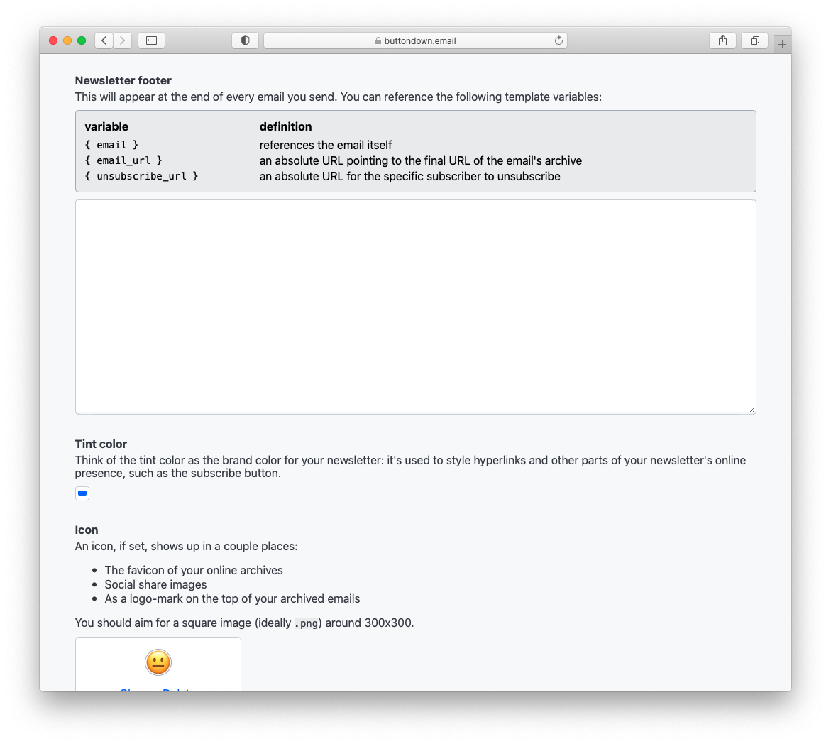
The result is a settings page that looks much the same, but with more information and detail than before:

Go over to your Settings and check it out!
