
At least three-quarters of the messages in your inbox likely contain HTML. Some of it is welcome, making newsletters, notifications, and even email signatures easier on the eyes. Then there is the abhorrent number of messages that use HTML to send spam, malware, or plain old junk. It’s, uh, a bit of a mixed bag.
We want you to express yourself, ok? Now, it’s up to you whether or not you want to just do the bare minimum. But when people come to Buttondown, it’s usually for the simplicity and the reliability. So it’s important to understand exactly how images affect your newsletter’s deliverability, accessibility, and legibility.
Email service providers and senders outright ban or penalize certain design choices and visual elements. Other flourishes live in a gray zone, not explicitly forbidden but discouraged by senders and flagged by subscribers (Interactive elements? Right to jail.).
Newsletter image choices and optimizations
Emails look different across devices, operating systems, networks, and email clients. If you want your dispatches to be read, shared, and enjoyed, they need to cater to the lowest common denominator, being as intelligible on a 10-year-old iPhone as they are on a desktop PC with HTML blocked.
A good rule of thumb for newsletters: If you didn’t create an image yourself, it doesn’t need to be in your newsletter. Screenshots of your app’s latest feature, the cover for your next book launch, art from your last exhibition, these are things that do not exist anywhere else and cannot be easily replaced by words. Splashy 10% OFF! banners, image-based subheadings, and other text-heavy banners, on the other hand, can trigger filters like SpamAssassin.
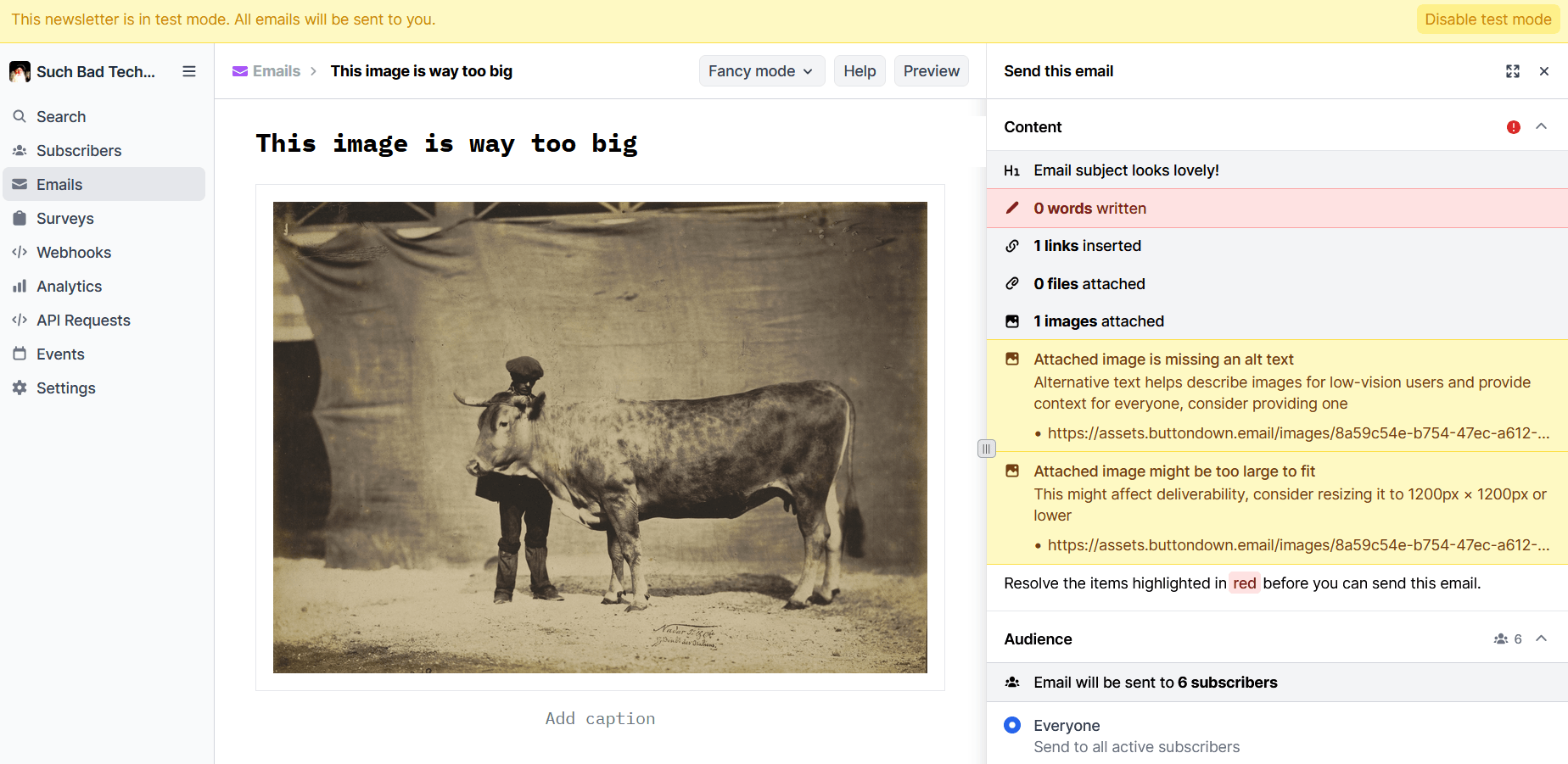
When you must include an image, make sure it’s between 600 and 1,200 pixels, no more, no less. Height is trickier to put a cap on. Generally, as long as subscribers don’t have to scroll to see the entire image, on desktop or mobile, and your images represent less than 25% of your content, you’re golden. You don’t want the ratio of images to text to be too big.
People like to complain about HTML in emails. But what they’re usually whinging about is a lack of restraint. “The difference that most people act on is a well-designed vs a poorly designed email - whether that be plain text or HTML,” Adrian Howard wrote in response to someone’s complaint about marketing emails. “A badly designed text mail will lose to a well-designed HTML one. A well-designed text mail will beat a poorly designed HTML one.”
Buttondown’s editor can help. As part of your pre-flight check, we’ll automatically compress images to the right size, make sure they're hosted by CDNs close to your recipients, and warn you if you turn off compression on an image that is too large. Of course, if you still want to review a draft in your email client before sending to your list, you can always enable test mode to see how things look on different devices and platforms.
Of course, there are fewer guardrails when you send your newsletter via API. You’ll need to use fluid tables or max-width: 100% CSS, even if images are less than 1,200 pixels wide. HTTPS src links are best, as base64 data will make your email look much larger to senders, and HTTP links will fail completely. Try to avoid as much CSS styling as you can and always check caniemail.com to make sure you’re not adding flair that isn’t supported by most email clients.
File size and format
Another gray area is image file sizes. Keep in-line images smaller than one megabyte, ideally no more than 300 kilobytes. You can always link out to higher-resolution versions.
JPEGs are usually the safest choice. While transparency in PNGs is a nice-to-have, it’s rarely essential and comes at the cost of significantly larger, slower-to-load files. WebP images are better supported by email clients than they used to be, but can make it harder for recipients to share your images elsewhere, and Gmail automatically converts in-line WebPs into JPEGs anyway. Embedded vector images, or SVGs, are supported by fewer than half of email clients (although support for linked SVGs is around 88%, Gmail is quite notable amongst the 12%).
GIFs are unique. They tend to be both larger than JPEGs and have smaller color palettes. So they don’t make sense for still images. Animated GIFs might work as a stand-in for video, and they’re supported by more than 97% of clients, but here be dragons.
Animated GIFs in email
A 2020 survey from Nielsen Norman Group found that positive sentiment towards an email decreased by 165% when an animated GIF was included (that is, sentiment went from positive to negative). Although those were reactions to control emails, messages from senders with whom the survey respondents had no prior relationship. If you’re signing up for a newsletter like Monthly Links of Interest or Shashasha, you probably know you’ll be getting GIFs in every issue.
An animated image can also be a useful workaround for email’s lack of support for embedding videos. For example, Curiosities by Tensegritics could have included nothing more than code snippets to demo updates to their ClojureDart + Flutter library, expecting readers to experiment on their own. But GIFs are so much more expressive!
A short, looping animation might seem like the best way to show off something you’ve built. And it theoretically wouldn’t run afoul of any ESP flags (at least, as of this writing). How many more people would view that than a link to a video walkthrough, though? And would that number be meaningfully large enough to justify the tradeoffs that come with animated GIFs?
“A well-formatted HTML email has the potential to be much more readable than any plaintext one. The issues come in execution,” Jeff Alyanak argues. “A sizable percentage who send HTML email fail to take accessibility into account.” This, despite the fact that making email accessible is something anyone can accomplish in a few minutes.
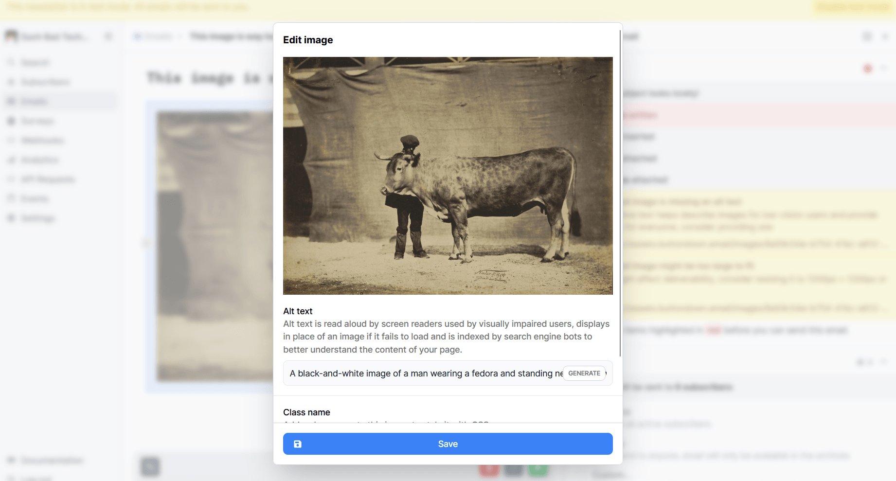
GIFs (and every other type of image!) should have descriptive alt text for recipients who use screen readers, as well as anyone who blocks HTML by default. On top of that, never send animations that might trigger a seizure (i.e., those that flash more than three times per second, are predominantly red in color, or take up most of the screen). Finally, when creating your animated image, keep the frame rate low and turn off looping entirely. Access * Ability wrote up a better breakdown of the WCAG motion guidelines than I could ever hope to improve upon.
There’s even a CSS styling, prefers-reduced-motion, that close to half of email clients will recognize. All you have to do is add animated-gif to a GIF’s class= and paste some CSS into your Email design settings:
Alternatively, the HTMHell Newsletter has a good walkthrough for how to set up JPEG fallbacks for anyone who has enabledprefers-reduced-motion in their email client. Again, that’s supported by less than half of email clients, so another approach might be to include a survey in your Welcome email that asks people about their design preferences and requirements.
By gathering a bit of subscriber metadata, you could draft different issues for subscribers with tags for things like color blindness, no-motion, no-HTML, etc. with a variable-powered email or list segmentation. That’s the sort of personalization that’s genuinely helpful without feeling creepy.
For most newsletters, though, images aren’t something to fret over. All you need to remember is to stick to images that are:
- Between 600 and 1,200 pixels wide
- Under 300kb
- Described with alt text; and
- Free of unnecessary text or animation; and
- Not annoying
So yea, if you could manage all of that, that would be great, mmk?
You don’t need 37 newsletter images to express yourself
“Sending out weekly newsletters can be a lot simpler than you think,” a user argued in /r/ecommerce. “Plain text emails are not only easier to create, but they also outperform fancy image-based emails most of the time.“
Anyone who invites you into their inbox is first and foremost interested in your work. If you didn’t pour your heart and soul into making an image, it’s likely just a distraction from something else that you did create. Put the focus on that.